User experience is the key to outperforming your competition without compromising your margins.
Let’s face it. If you could use user experience to sell the same product or service as your biggest competitor for more profit, without seeing a decline in your number of sales, you would. In a heartbeat.
I have some good news for you; it’s do-able.
And, most importantly, not in a “Pay me £20k for my 3 month course entitled HOW TO BE A BORN WINNER, CRUSH THE GRIND, & LOOK SEXY” kinda way.
The answer is simple.
In fact, the answer is ‘simplicity’.
User experience
User experience (UX or UE) can be defined as;
…how a user interacts with and experiences a product, system or service. It includes a person’s perceptions of utility, ease of use, and efficiency.
https://en.wikipedia.org/wiki/User_experience
User experience should inform all design but, unfortunately, this is often not the case.
In the physical world IKEA is a great example of user experience. Their floor plan is laid out to take users through a methodical list of rooms in their house. This is perfect for every user as it caters for those looking purely for bathroom fittings, as well as users in the middle of a complete renovation. The sections are clearly marked and have everything you may need in one place.
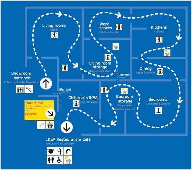
Last place before the exit – the kids area. Any children you have with you are now bored and misbehaving so any distraction is welcome. For those without kids it marks an easy sprint finish.
This is followed by IKEA’s pièce de résistance…
Who isn’t hungry after a few hours wandering around a shop?! A furniture company becoming a destination for meatballs is user experience at its finest.
Can you buy cheaper flatpack furniture that’s (in all likelihood) just as good? Just as easy to put together? Has the same badly drawn instructions that lead the inexperienced DIY-er down avenues of frustration and rage they’d hitherto not experienced?
Probably.
Is IKEA the market leader regardless?
Yup.
User Experience online
A perfect example of online user experience was shown to the other half of QUAFF Digital, Kate, a few days ago. We needed to buy Covid tests. Our eldest was heading away on a school trip to Iceland (lucky bugger) and we needed tests for once they’d come back.
You may think that buying a Covid test is a piece of cake these days. You may think the information online about which tests you need to take when going abroad, and when you need to take them would all be available and easy to understand. You may think that all of the information provided was identical so there was no possibility of any confusion.
I certainly assumed that.
I must caveat this next bit by saying Kate is a serious surfer (internet-wise) and can usually find anything at all before I’ve finished typing my first search term.
It took her 2 hours to find a website that gave her precisely the information she needed about international travel, from a website she trusted, in a clear & easy to understand way.
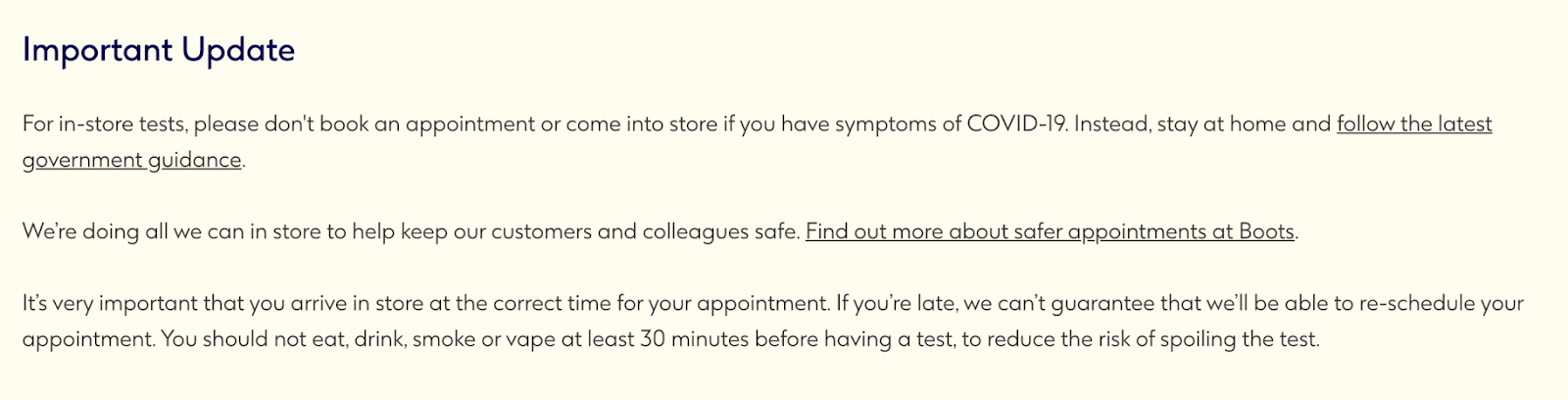
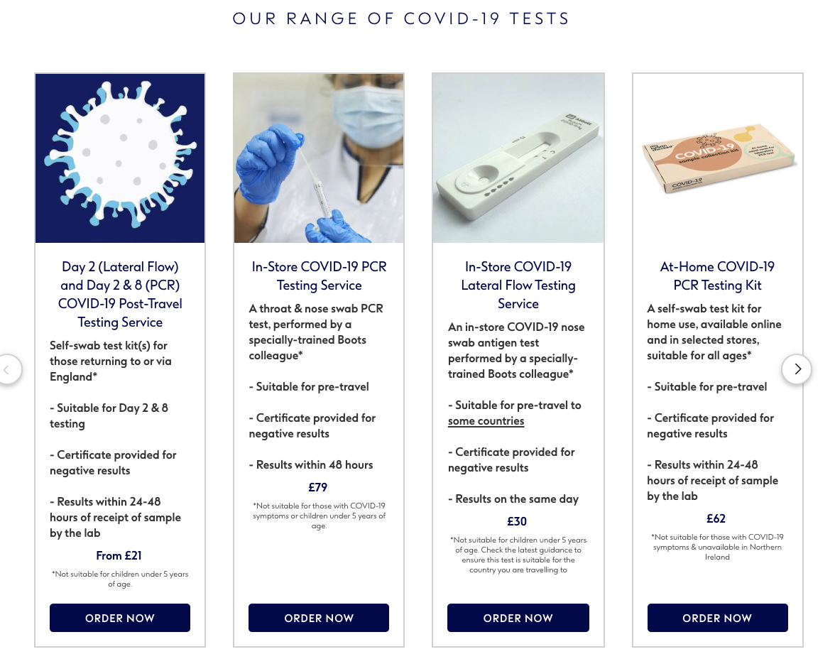
It was https://www.boots.com/services/covid-19-testing – yes, trusty ol’ Boots to the rescue.
The tests on Boots start at £21. You can buy Covid tests online from around £10. So how do Boots sell the same product for twice the price? They utilise great user experience.
Many other websites, let’s make up an example of ‘covid-tests-r-us.co.uk’, had obviously been thrown together quickly to try and capitalise on test sales. They were littered with issues that ruined their user experience.
Things like;
- Not being a secure site.
This is a real red flag, particularly when you’re charging customers online. An unsecured site means user’s payment details may be at risk. ❌
- Formatting issues
If a website looks like it’s being thrown together in Microsoft Word and uploaded no-one is going to take it seriously. Lists should line up, bullet points need text next to them, buttons should work, and images should be relevant. ❌
- Wrong or incomplete information
Out of date or plain wrong information will result in frustration and a lack of trust from users. Not conducive to a buying decision. ❌
- Dodgy names
Taking the example of ‘covid-tests-r-us.co.uk’ from earlier – this website has clearly been put together with one thing in mind. It may even be owned by another business that has never sold anything like Covid tests and has no expertise in that industry. Again it comes down to a lack of trust from a user. ❌
So, what did Boots do differently?
They provided clear, up-to-date advice that is easy to understand.
That’s it.
Simplicity.
They took the time to make it as easy as possible for users to find the information they need, see their options, and make a purchase.
They’ve more FAQs at the bottom of the page and a ‘Contact Us’ call to action at the bottom of the page if a user needs more help.
How much does user experience design cost?
The process of building user experience into your design can take time and can cost a few thousand pounds to get right. It’s often best to incorporate user experience design into a website rebuild so everything can be built with UX in mind. Altering an existing site can take longer and be more complex, but is absolutely possible.
The cost of UX is one of the rare elements of digital marketing that has an ROI that can actually be quantified. It must, however, go hand in hand with good SEO and good general online practise – great UX on a bad website is like polishing the proverbial.
Is user experience design worthwhile?
It would be odd if I said ‘no’ at this point, wouldn’t it!
UX is the edge many businesses are looking for over their competitors. It can provide long term increased revenue, decrease the need for expensive website re-design, build your businesses reputation as an easy company to deal with, and help your general SEO & CRO scores.
What’s not to love?!
If you’d like to discuss how UX design can help your business, get in touch.